Contributed by Rob Kaiser-Schatzlein / The four paintings I looked at in Daniel Kingery's Bronx studio are all medium-sized, human scale. Paint application strategies vary across each canvas, but overall the surfaces have a stiff, solid sheen. Kingery paints in layers, applying and completing each before beginning the next. Sometimes this means a physical imposition of paint on top of paint, as in the Self-Portrait as Taylor Swift or The Sack of Minerva's Temple (after St. Augustine and Richard Prince). The more loosely painted untitled self-portraits are contained in a square, while the stenciled paint seems to hover over it.
Kingery began the conversation with a rant about the fact that his landlord is raising his studio rent by about 50% (for comparison, rent-stabilized apartments in New York City are limited to less than a 2% increase per year). After discussing that depressing news, we got down to talking about his recent work.
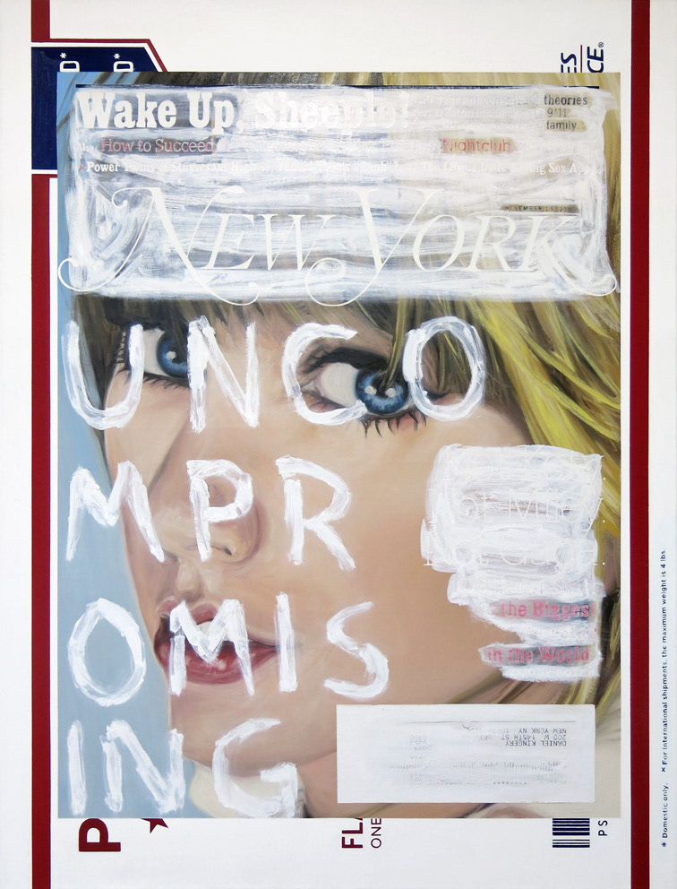
[Image at top: Daniel Kingery, Self-Portrait as Taylor Swift, 2014, oil, oil stick and acrylic on linen, 66 x 50 inches.]
Kingery began the conversation with a rant about the fact that his landlord is raising his studio rent by about 50% (for comparison, rent-stabilized apartments in New York City are limited to less than a 2% increase per year). After discussing that depressing news, we got down to talking about his recent work.
[Image at top: Daniel Kingery, Self-Portrait as Taylor Swift, 2014, oil, oil stick and acrylic on linen, 66 x 50 inches.]
Daniel Kingery, Untitled Self-Portrait (Prince), 2015, Oil and acrylic on linen, 60 x 40 inches
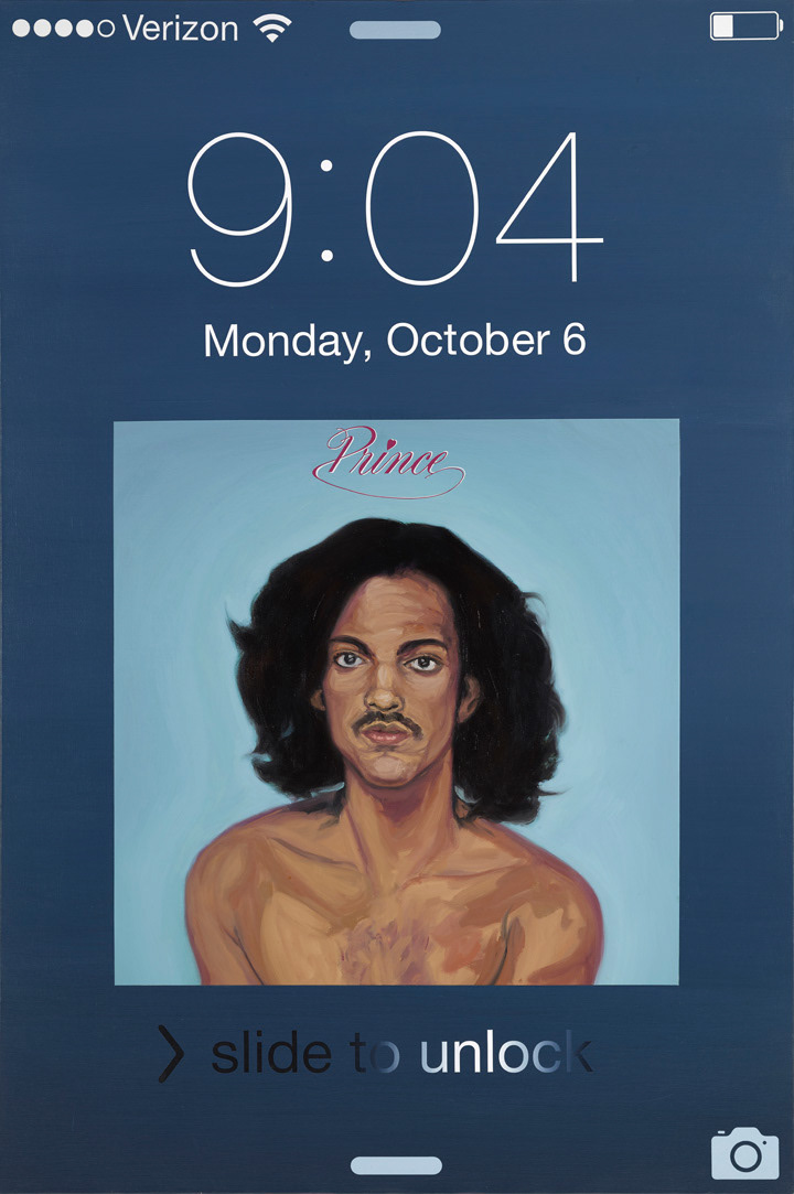
Rob Kaiser-Schatzlein: Why are these paintings hung so high? [The iPhone paintings' center is maybe six feet off the ground.]
Daniel Kingery: I hung these paintings at this height to document them, pretty much. Also, I hung them at this height when I noticed that because of the placement in the iPhone design the portrait is lower. The funny thing about doing these paintings based on the iPhone screenshots is that if you hang it at a more standard height you are looking down on the portrait. When I hung it a little bit higher, his head–Prince’s–is pretty close to my height. That was a funny side effect.
The newest paintings I did were the iPhone self portraits. The very newest is David Bowie and the one before that was Prince, but I finished them within pretty close succession to each other.
RKS: You worked on them at the same time?
DK: Yeah, in part.
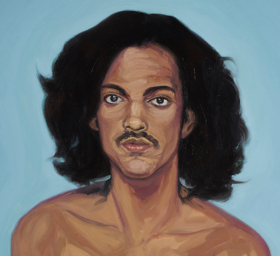
Detail, Untitled Self-Portrait (Prince)
RKS: Which part?
DK: I did the lettering by using vinyl cut-outs, and I did the Payne's Grey background at the same time. So I did that part first and I taped off the area that would be the record cover and painted the Prince cover in it's entirety, then I did the David Bowie right afterwards.
RKS: You did them both in stages?
DK: Yeah, that's how most of my recent work has been done. It's a lot of layers of text, things like that first, taping off different areas, and blocking things out before I get to the part that's the actual oil painting. And that's one of the quickest steps. Everything else, the planning and execution has taken a lot longer. With the Richard Prince and Taylor Swift paintings I was cutting out all the letters, for the stencils, by hand. That just took ages. It wasn't until a friend of mine suggested doing vinyl lettering for these, which makes perfect sense! [both laughing] I just hadn't thought of it.
RKS: Which is crazy because we work in museums and galleries, where vinyl lettering is so common. I wouldn't have thought to use vinyl either, and didn't realize this was vinyl stencil. But once you said it, it felt obvious.
DK: It was the longest part of the process with the Taylor Swift and Richard Prince paintings--just cutting out the letters. Which seems ridiculous. It was a learning process making the vinyl, and fun because I had to learn Illustrator to make a vector file in order to do the print. Recreating the iPhone layout for these was interesting because I started to notice little design decisions that Apple made for the screen, like spacing and little changes. They use Helvetica Neue but there are all these different kinds of Helvetica Neue. Usually Helvetica Neue has two squares as the colon and they replaced it with two circles, or for example, they changed the spacing in some places.
RKS: Like when you copy famous paintings in school, to figure out how they work.
DK: Yes: reverse engineering.
RKS: How do you start a painting?
DK: All of these paintings came about as happenstance. But once I start working on the painting, I know exactly what I’m going to make.
RKS: You do a sketch? Or computer mock-up? Or there’s an image in your mind?
DK: A little bit of each, there’s a bit of chance and spontaneity in the compositional process. Usually with these [Taylor Swift and Richard Prince paintings] it is a collage, and with the iPhone self-portraits, it's a screenshot.
RKS: So this Taylor Swift painting is a collage you reproduced in painting? You’re making a collage--gluing, pasting, painting--and that's your sketching process?
DK: Yeah, every piece that I make may come about in a circuitous way, but I decided to make it into a painting because I have something specific I want to say with that image. With this one [Taylor Swift] it was 2013, and when I went over to my friend's apartment, he had this magazine out. I had never heard Taylor Swift’s music before, and when I saw this image on New York Magazine, I was really drawn to it. Something about the certain type of American-ness she exuded.
Having lived in Berlin for 12 years and just returned, I found something fascinating about that. I was re-exploring and relearning what it means to be American. It was something about the look in her eyes that had a kind of willful naivete to it, that drew me to the image. So I had this image in my mind of the word "Uncompromising" written across her face in block letters.
RKS: Was it his magazine, or had you gone out to buy one?
DK: It was his actually, because you know, he hates Taylor Swift.
RKS: So that address label is made up? [The painting has his address on it.]
DK: Yes, I'll get to that! So I had these Priority Express envelopes kicking around, too. In Germany you never see the national flag anywhere, maybe occasionally at soccer games. They have a totally different relationship with the flag because of their national history. Nationalism in general. Coming back to America, even a pizza box has flags on it or Budweiser cans with red, white, and blue colors. Even the envelope. I did the collage on this envelope and it exuded American-ness
RKS: Was it an accident it ended up on the Priority Express thing?
DK: It's sort of happenstance but I had this image in my mind of the Taylor Swift, and had the envelopes around for similar reasons. I had already thought about using them for a collage.
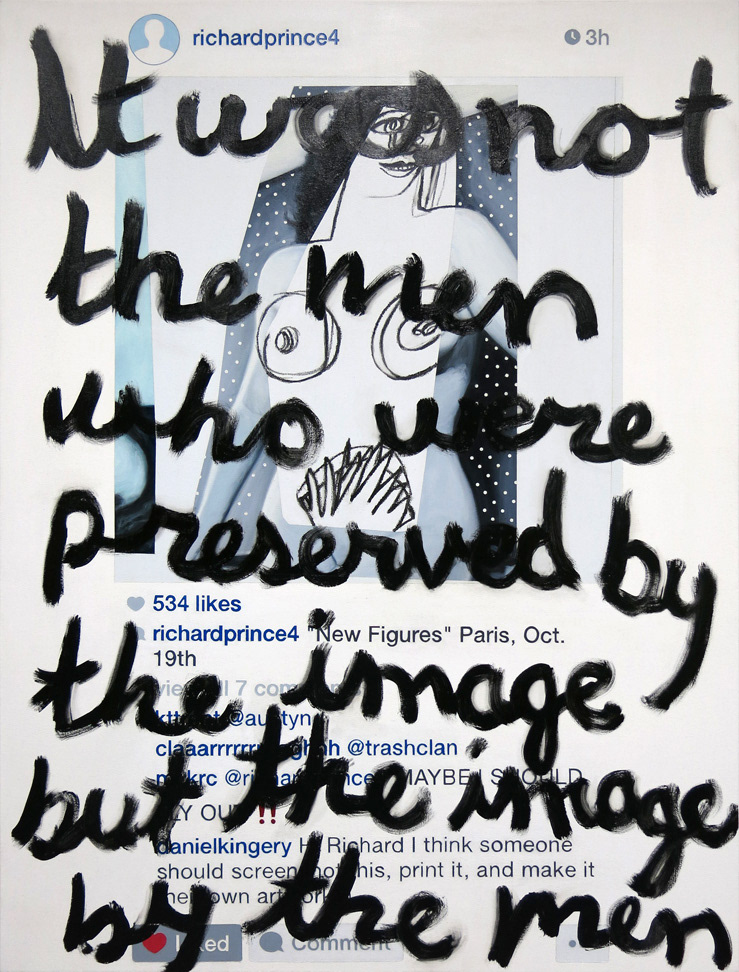
Daniel Kingery, The Sack of Minerva's Temple (after St. Augustine and Richard Prince), 2015, Oil, acrylic, oil stick, and wax crayon on canvas, 66 x 50 inches.
RKS: You have the supplies sitting around that are pre-loaded with information.
DK: Once I made the collage and realized that it was a self-portrait, I felt compelled to make a painting of it. Also, I have a background of figurative oil painting. In Berlin, I went through a personal crisis where I took a large step back from figurative painting, and then from painting in general. During that period I made a lot of collages. I just went to the studio, for a really long period of time, not planning what I was gonna do and just seeing what happened. One of the things that happened was that I did this series of collages where I was gradually trying to express more things about my life. That became more focused after moving to New York.
I had been wondering how I could make these collages into something bigger like a painting. There were a lot of different ways of doing it like using inkjet printing, blowing it up and pasting it on a canvas. A lot of things were too similar to what other artists were doing. Maybe Albert Oehlen or someone like that, who was a big influence. Eventually, after being here it just occurred to me one day, through all the years of practicing figurative oil painting, I'm lucky to be at a point where I can do it pretty quickly. I used to spend months, once I spent over a year on a single painting. On the Taylor Swift piece I did the figurative part in two days. So anyway, it occurred to me it would be faster and easier to paint it rather than print it. Also, it's transformed when you paint it. I never project images, I always just take a couple of points. I do the math to figure out where’s the point of her cheek.
RKS: It's not grid transfer?
DK: No, usually I'll take about four points. Where does her nose end, where does her cheek end, where does her chin end, where is her right eye. I might measure out those four point. With Prince, I did the chin, the top of the hair and each shoulder then I can do the rest. Because I'm not doing them ultra-photorealistically and I'm doing them sort of quick, I'm preserving the painterliness. You see the brushstrokes and you see it's a painting.
RKS: It's not a reproduction.
DK: Yeah it comes from the tradition of portrait painting. I find it a lot more satisfying to paint in a looser style and I find the result much more satisfying than when I used to go in and try to get every detail perfect. I noticed when you try to get every detail perfect, you just end wasting tons of time and don't even get a better result. Sometimes when I almost don't even look, and let the brush and oil paint do whatever it wants to. Sometimes something happens there that is fascinating. Part of it is because it's fun to paint and I enjoy it. I also would be less satisfied with a perfect photo reproduction, and even things that are seemingly perfect photo reproductions actually don't even look realistic
RKS: They’re embellished, even a little bit.
DK: That's something I realized years ago when I saw the Pre-Raphaelite paintings in person. They are very beautiful, but they are so focused on detail that it becomes unrealistic--we don't see that way. These paintings come from a tradition, 19th century and prior, where they were copying in a sense. Someone like John Singer Sargent is copying a person who is sitting in front of him. But he is letting the paint do the talking.
RKS: It's half figurative, because you’re not painting people you're painting from a two dimensional image. You're adding in what you know of the figure.
DK: It’s something that happens during the process of painting. I realize that to make this Prince painting I needed a yellowish hue painted into a purplish hue and that gives it a certain three dimensionality. I go through the process and don't embellish necessarily, but make it my own.
RKS: How do you know when you are done?
DK: It varies from painting to painting, but I liked leaving some things semi-unfinished because it’s sitting well already and I don't need to do anything else. I've done the opposite and gone too far. Like in Prince's shoulder, I wasn't even thinking about it I just did a few brush stroke to get a dark area here and light area there. You learn...
RKS: What you can get away with?
DK: Something like that, more like how it's sitting. His left shoulder, from our perspective right is really crudely done, but it doesn't detract. With portrait painting the attention is always on the face, things radiating out from the face can be less finished. You have pay attention to hands because hands are unique and difficult as well. But other parts, like clothes or hair you can do less work on.
RKS: Like Bowie's sleeve there.
DK: Exactly, but the hand coming out of the sleeve I had to spend much more time on.
RKS: You're painting until there isn't anything detracting from the image.
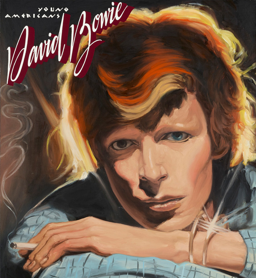
DK: It's doing just enough to express what I'm trying to express, but not going too far. It's even less rational than that, it's about a feeling. With the Prince painting, the song was "I Wanna Be Your Lover", and I knew it had to exude that. Especially in the eyes and body language. Of course he is doing that in the cover but that has to be broadened to the tradition of figurative painting. There is a halo around him that had to embody an almost religious presence. With David Bowie, he had to be saying with his eyes, "Can You Hear Me?" it has to be this asking, to the viewer. It had to be on one hand bold, a challenge, and also a sadness and desperation.
DK: Once I made the collage and realized that it was a self-portrait, I felt compelled to make a painting of it. Also, I have a background of figurative oil painting. In Berlin, I went through a personal crisis where I took a large step back from figurative painting, and then from painting in general. During that period I made a lot of collages. I just went to the studio, for a really long period of time, not planning what I was gonna do and just seeing what happened. One of the things that happened was that I did this series of collages where I was gradually trying to express more things about my life. That became more focused after moving to New York.
I had been wondering how I could make these collages into something bigger like a painting. There were a lot of different ways of doing it like using inkjet printing, blowing it up and pasting it on a canvas. A lot of things were too similar to what other artists were doing. Maybe Albert Oehlen or someone like that, who was a big influence. Eventually, after being here it just occurred to me one day, through all the years of practicing figurative oil painting, I'm lucky to be at a point where I can do it pretty quickly. I used to spend months, once I spent over a year on a single painting. On the Taylor Swift piece I did the figurative part in two days. So anyway, it occurred to me it would be faster and easier to paint it rather than print it. Also, it's transformed when you paint it. I never project images, I always just take a couple of points. I do the math to figure out where’s the point of her cheek.
RKS: It's not grid transfer?
DK: No, usually I'll take about four points. Where does her nose end, where does her cheek end, where does her chin end, where is her right eye. I might measure out those four point. With Prince, I did the chin, the top of the hair and each shoulder then I can do the rest. Because I'm not doing them ultra-photorealistically and I'm doing them sort of quick, I'm preserving the painterliness. You see the brushstrokes and you see it's a painting.
RKS: It's not a reproduction.
DK: Yeah it comes from the tradition of portrait painting. I find it a lot more satisfying to paint in a looser style and I find the result much more satisfying than when I used to go in and try to get every detail perfect. I noticed when you try to get every detail perfect, you just end wasting tons of time and don't even get a better result. Sometimes when I almost don't even look, and let the brush and oil paint do whatever it wants to. Sometimes something happens there that is fascinating. Part of it is because it's fun to paint and I enjoy it. I also would be less satisfied with a perfect photo reproduction, and even things that are seemingly perfect photo reproductions actually don't even look realistic
RKS: They’re embellished, even a little bit.
DK: That's something I realized years ago when I saw the Pre-Raphaelite paintings in person. They are very beautiful, but they are so focused on detail that it becomes unrealistic--we don't see that way. These paintings come from a tradition, 19th century and prior, where they were copying in a sense. Someone like John Singer Sargent is copying a person who is sitting in front of him. But he is letting the paint do the talking.
RKS: It's half figurative, because you’re not painting people you're painting from a two dimensional image. You're adding in what you know of the figure.
DK: It’s something that happens during the process of painting. I realize that to make this Prince painting I needed a yellowish hue painted into a purplish hue and that gives it a certain three dimensionality. I go through the process and don't embellish necessarily, but make it my own.
RKS: How do you know when you are done?
DK: It varies from painting to painting, but I liked leaving some things semi-unfinished because it’s sitting well already and I don't need to do anything else. I've done the opposite and gone too far. Like in Prince's shoulder, I wasn't even thinking about it I just did a few brush stroke to get a dark area here and light area there. You learn...
RKS: What you can get away with?
DK: Something like that, more like how it's sitting. His left shoulder, from our perspective right is really crudely done, but it doesn't detract. With portrait painting the attention is always on the face, things radiating out from the face can be less finished. You have pay attention to hands because hands are unique and difficult as well. But other parts, like clothes or hair you can do less work on.
RKS: Like Bowie's sleeve there.
DK: Exactly, but the hand coming out of the sleeve I had to spend much more time on.
RKS: You're painting until there isn't anything detracting from the image.
DK: It's doing just enough to express what I'm trying to express, but not going too far. It's even less rational than that, it's about a feeling. With the Prince painting, the song was "I Wanna Be Your Lover", and I knew it had to exude that. Especially in the eyes and body language. Of course he is doing that in the cover but that has to be broadened to the tradition of figurative painting. There is a halo around him that had to embody an almost religious presence. With David Bowie, he had to be saying with his eyes, "Can You Hear Me?" it has to be this asking, to the viewer. It had to be on one hand bold, a challenge, and also a sadness and desperation.
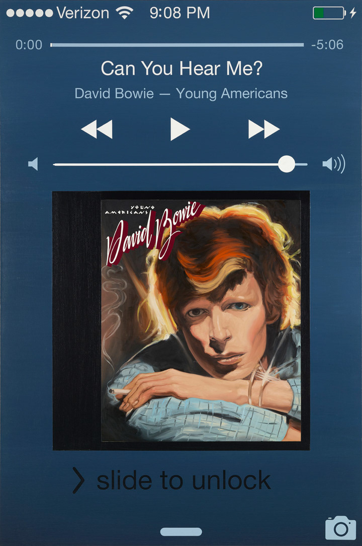
Daniel Kingery, Untitled Self-Portrait (Can You Hear Me?), 2015, oil and acrylic on linen, 60 x 40 inches.
RKS: That has to do with what the goal of the painting is? You are reflecting back on what you wanted to convey, and you look at it and see if it hits those notes.
DK: That's exactly it. With Taylor Swift it was super-important that her eyes had to have this certain look and a certain boldness. She's looking right at you with this kind of innocence and vulnerability that is also kind of a challenge.
RKS: Do you have any pictorial strategies that you come back to?
DK: With painting I'm less interested in that, I use formal qualities that I have developed through collage making. I guess I'm more focused on--as directly as possible--trying to say what I'm trying to say. Here's one thing that's definitely true, what I've learned from collage making in terms of composition, is just the straight-up layering. And obscuring what is underneath. Another thing I learned doing collage, that I still do often, is I'll do a lot of unconscious gesture making with Conté and then collage on top of that, just so I have a ground to work into. I have used that in some of my paintings and it will come back in some of the others as well. Interestingly enough, a banal gesture as soon as you can't see most of it it becomes really fascinating. I found that to be true in a lot of cases and sometimes like in the Richard Prince and Taylor Swift painting, before I did the lettering on top they could have been interesting by themselves, but I wanted to convey a certain message and that message was tied to the specific layer of text. I find them visually more interesting than just, say, a painting of Taylor Swift. With the painting of Richard Prince, with the layering of text it recontextualizes the figure of the Betty Paige/Picasso collage. The quote is about the destruction of a temple in Troy, where they slay the guards and protect the Minerva, so Betty Paige becomes like the Minerva being protected by Richard Prince or myself. So the text overlay makes it so there is something else going on besides me just appropriating an appropriation artist.
Another thing--I've often applied this in my collage--I like when things are just bit askew or falling out of the picture frame and have some element of weight. When I saw the Malevich square for the first time in person, one of the things I realized about it was that it was actually shifted just slightly off so it seemed almost like it was in movement. That is something that really stuck with me. Compositionally one of my favorite artists is Ellsworth Kelly. I like the work that he did in Paris in the 1950'. One time a friend came to a studio visit when I was doing abstract work, a few years ago, and he said, “Oh your works are somehow positioned between being compositional and anti-compositional” and he didn't mean that as a compliment. But I actually thought it was a compliment. I felt like that was right and that was what Ellsworth Kelly does. He places a slight emphasis on something, a little more weight over here. Very subtly. That is one compositional technique that I tend to used.
RKS: Are you reproducing the method of collage in the painting? You do one layer and then you do the next?
DK: It's not exactly the same but it's based on the collage process. For example, you were asking before about the address in the Taylor Swift painting. When I realized it was a self-portrait I changed certain things about it. I had to incorporate my actual address instead of my friend’s.
RKS: If your friend was part of your message it would have stayed and would have been one of those happenstance things, but it wasn't, so you changed it.
DK: It's an editing process. In this series where I'm doing the text as the final layer there's a huge risk and anxiety doing the final layer because I've put a ton of work into the painting up until that point. And these last two were all stencils with all these different colors. I had to do lots of layers and plan things out very carefully. To paint over it, because some of it is even on the gesso background, I have exactly one chance. There's a huge amount of anxiety and risk, but I like taking it.
Detail, Untitled Self-Portrait (Can You Hear Me?)
RKS: Is there an example of problem with your painting that you resolved?
DK: With the Prince painting, I went back and forth a lot. I wasn't sure if I was gonna have another version of the screenshot where it had the name of the song, "I Wanna Be Your Lover." I really struggled with which one I was gonna do. It was the first screenshot I ever did, and David Bowie was the second. I struggle with whether to include the text or have the date and time. The date has an iconic quality that I really like visually but the song title underscores and strengthens what's already happening in the image. Ultimately I decided to include just the date and time and let Prince speak for himself in this case. I was in a lot of doubt even afterwards. I wondered if I should do another one that included the text.
Another change was in the process of the Taylor Swift painting, from the study collage, I blocked out the text to have it be more focused on her and her face. I thought that since you weren’t going to see it anyway I wasn't going to create the text, but I realized I had to recreate the text. In the last phase, while the paint was still wet, I used a turpentine rag to mess with the top text layer because they had to have a certain quality to them. But at the same time, I decided to wipe away certain areas of magazine text that had certain autobiographical significance.
RKS: Do you have a best time for working?
DK: I will typically spend twelve hours in the studio.
RKS: Which twelve hours?
DK: A pretty typical day for me is getting up at 8:30, when I'm working for myself. I'll take a long time and eat breakfast, prepare some food to take with me to the studio and something to read. Maybe run an errand or two or go to the art supply store, Artist and Craftsman Supply on Adam Clayton Boulevard. Often I'll end up not getting to the studio until eleven or twelve and I stay until eleven or twelve at night.
RKS: You only pack one meal?
DK: Sometimes I'll pack two, or eat a big breakfast. Or get something in the neighborhood.
RKS: I would need two meals for twelve hours.
DK: I have gotten in the habit of eating less. Especially when I get into a work flow. I forget that I'm hungry. A lot of times I'll go back home, and have a light snack at night. Like a piece of bread with something or an apple with some peanut butter.
RKS: Most of these are linen, but the Richard Prince painting is cotton duck?
DK: Richard Prince and Taylor Swift are cotton duck, because at the time I didn't have enough money for linen, but since then I have found a place where I can order a roll of linen for a reasonable price. All of my next paintings will be on linen.
RKS: Because your work is very flat.
DK: Yeah, I like that quality and another reason is that leaving the sides that you see, and having them be that darker linen is something I've started to do. I had a friend in Berlin who always taped off the sides and I really liked that effect. Especially with linen, I like seeing that. I don't know why.
RKS: You do a rabbit glue sizing and a couple layers of gesso?
DK: And usually I'll sand it down. It was really difficult doing the background of these two iPhone screenshots because it was pretty hot out. I did a mixture of acrylic for the Payne's grey gradient of the iPhone background--I don't really use acrylic that much, only for the lettering really. If I'm going to put a stencil down it's easier to block out if it is on an acrylic background. But it was drying really quickly because it was so warm out and I had to do a ton of layers. I'm used to using oil where you have forever to get the blending right. I had like twenty minutes. I had to use tons of Payne's grey attempting the effect I wanted. I had to do it in practically quarter sections. I'll probably have to that with all twelve of these screenshot paintings.
RKS: Any other material I wouldn't notice?
DK: All of these are oil and acrylic, sometimes an oil stick.
RKS: How long do the paintings take?
DK: It depends, but I have actually figured out that, more or less, when I am painting just for myself, I can do one of the iPhone paintings in a week to ten days. A painting the size of the Richard Prince painting would be, from start to finish, two to three weeks.
RKS: Are these all one series?
DK: Definitely two series. One incorporates texts from literary sources and are usually self-portraiture or make some kind of autobiographical statement. And then I make the iPhone self portraits. I have new ideas planned for both series.
-------
Daniel Kingery was born 1980 in Urbana, IL, and lives and works in New York, NY.